What is data journalism?
Paul Bradshaw from Birmingham City University says:
Data can be the source of data journalism, or it can be the tool with which the story is told — or it can be both.
The Bureau of Investigative Journalism says:
Data journalism is simply journalism.
The former is a new and trendy term but ultimately, it is just a way of describing journalism in the modern world.
Learning goals
Practical skills
- Where and how to get data in New Zealand
- How to use data for and in stories
Mindset skills
- Confidence to source and use data in a story
- Data is (just) another source
- Just like other sources data must be treated fairly and in context
One number in isolation is almost certainly misleading
Why use data in stories?
- Context
- Trust
- Clarity and/or conciseness
- Engagement
What does data give the narrative?
Narrative/Cognitive tension?
Not sure exactly what to call it - but I think it is important.
Data is a social product
Sometimes what isn’t measured is more interesting that what is.
Women’s work - 1891 vs today
Ethnicity in New Zealand 2001 to 2018
Inspiration
What roles does data have in journalism?
- More and more stories need (or are enhanced by) analysis and communication of data.
- Data can serve as the primary source for an story.
- Data can also be the used to tell the story
Chart choice
- Different charts will highlight different aspects of your data more effectively.
- Choose the chart that shows the aspect of the data that you are interested in
- Line and Bar charts are often a safe choice
- Take care with maps and pie charts
FT Visual Vocabulary
Bad or deceiving charts
- Charts and graphs can be used to deceive
The best way to get a sense for bad charts is to peruse vis.wtf or /r/dataisugly. There is also a good writeup here
The most common bad things are:
- Incorrect, missing, or misleading labels
- Inconsistenct scales
- Truncating scales
- Comparing things that shouldn’t be
- Too many things
A few rules
- Barcharts always start at 0
- Line charts don’t need to start at 0, but always ask yourself if the range you select is going to
make an insignificant change look important
- Only use pie charts for parts of a whole and only when there are less than 5 categories
- Avoid maps for showing quantities
- LABELS
New Zealand is a mess (this doesn’t cover DHBs, Police Districts, Civil Defense, or Fire and Emergency areas)
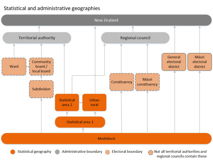
There are no suburbs
Ask for help! - the Figure.NZ really want to help data@figure.nz
Also take a look at Figure.NZ Places
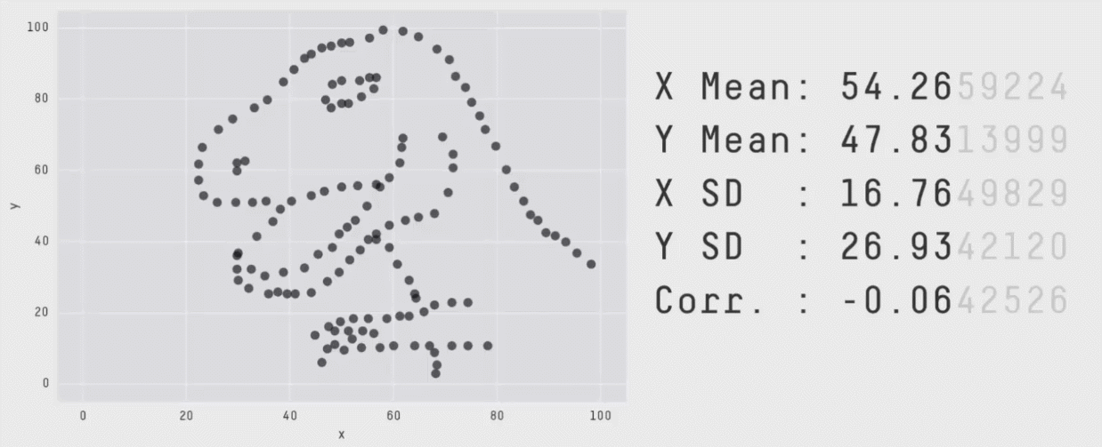
All summary statistics hide things
The mean and standard deviation are the same for each of these graphs