Introduction to making charts with datawrapper
Datawrapper
Datawrapper is widely used by journalists, and was created by journalists, to
Enrich your stories with charts, maps, and tables.
- It’s free (there is a paid plan but it targets larger organisations)
- It provides well designed and sensible defaults making it easy to create a good-looking chart
- Charts will continue online if you close your account
Fantastic blog- well worth reading to get you started thinking about what makes a good chart
Datawrapper has been seen in the wild in the New Zealand Herald, Stuff, RNZ, Newsroom, and The Spinoff. So it’s a useful skill to have in the New Zealand market.
(Yes I know these examples are slightly misleading - exactly why is left as an exercise for the reader)
Sidebar: Flourish
Many New Zealand news organisation use Datawrapper. But Flourish is also popular. e.g
Flourish and Datawrapper are very similar tools. Datawrapper is focused on static charts, Flourish provides more interactive options.
What is a chart?
- Or what makes something a visualisation as opposed to a graphic?
What is a chart?
A chart (sometimes known as a graph) is a graphical representation for data visualization, in which “the data is represented by symbols, such as bars in a bar chart, lines in a line chart, or slices in a pie chart”.
Why use charts?
Exercise
Company A has 10 employees. Each employee earns $100,000 per year. What is the average salary?
Company B has 10 employees. 9 employees earn $10,000 per year. 1 employee earns $910,000 per year. What is the average salary?
Company A has a good year and applies an average salary increase of 10% - everyone now earns $110,000.
Company B has a good year and applies an average salary increase of 10% - 9 people still earn $10,000 and 1 person earns $1,010,000.
Digressions — Why?
All summary statistics hide things
The mean and standard deviation are the same for each of these graphs
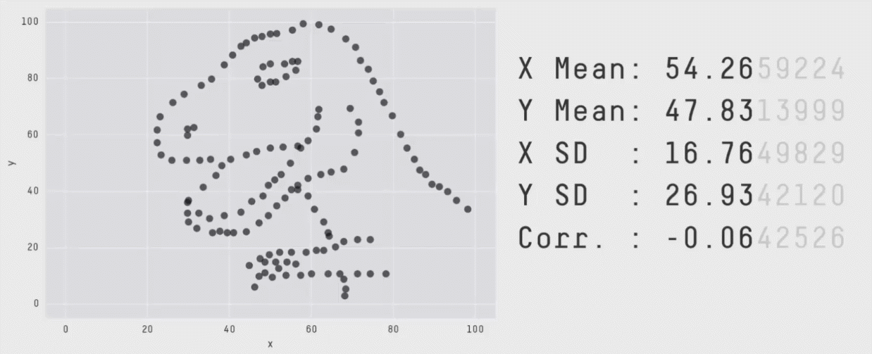
Chart choice
- Different charts will highlight different aspects of your data more effectively.
- Choose the chart that shows the aspect of the data that you are interested in
- Line and Bar charts are often a safe choice
- Take care with maps and pie charts
Bad or deceiving charts
- Charts and graphs can be used to deceive
- Don’t do this.
The best way to get a sense for bad charts is to peruse vis.wtf or /r/dataisugly. There is also a good writeup here
The most common bad things are:
- Incorrect, missing, or misleading labels
- Inconsistenct scales
- Truncating scales
- Comparing things that shouldn’t be
- Too many things
A few rules
- Barcharts always start at 0
- Line charts don’t need to start at 0, but always ask yourself if the range you select is going to make an insignificant change look important
- Only use pie charts for parts of a whole and only when there are less than 5 categories
- Avoid maps for showing quantities
- LABELS
Exercises
- Locator maps
- Graph company A and B from above
- Recreate a chart from Figure.NZ
- Add
/data.csvto a url
- Add
- Titles, captions, and alt-text
- Annotations